Friday 1st December 2023
Advertising and Marketing
LO: To explore the aims and conventions of print advertising.
The main aim of advertising is to bring attention to a product, service or issue.
All adverts aim to communicate a clear message about the product, service or issue.
Depending on the type of campaign it might also:
- Raise awareness
- Inform or educate
- Persuade audiences
- Create a unique selling point
Raise awareness ---> Covid 19 how to wear a mask / Raising awareness to the situation and what to do due to this.
Inform or educate ---> KFC apology / To apologise and inform people they have acknowledged their mistake and that they apologise for any inconvenience it had caused
Persuade audiences ---> Coke: A bottle for everyone / Persuading people to buy their drink by saying no matter who you are, it's for everyone
Create a unique selling point ---> Ikea / To show that you don't need many tools to make their furniture
Commercial:
- To make money by promoting consumer goods or services
- Generally focuses on persuading audiences to purchase goods
- Aims to communicate a message about a brand
- If an established brand, aims to reinforce existing brand image to encourage brand loyalty
- Creates a sense of need or desire and a sense of aspiration
Non-Commercial:
- Includes public information drives
- Some simple aim to inform about an issue, many also aim to persuade the audience to donate money or time to charity
- Often uses shock tactics or direct appeals
- Some use different techniques to defy expectations
- Seek to represent true aspects of reality rather than an aspirational world
Wednesday 6th December 2023
Advertising and Marketing
LO: To explore the codes and conventions of print advertising.
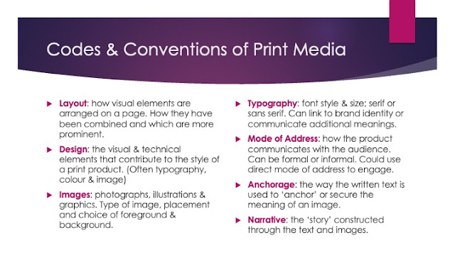
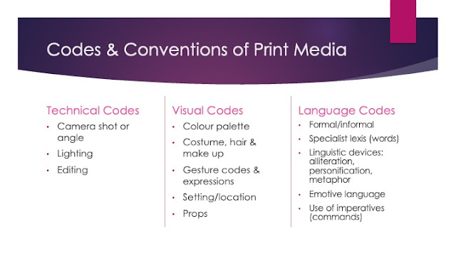
Codes and Conventions - The expected elements that will be included in products from particular media forms and genres.
Commercial

The main aim of this advert is to promote their drink as the best as though nothing is better.
By having the drink laying in ice makes it seem very refreshing.
The bottle also says classic on it showing how this drink is unique and one that many people would choose which again would increase the desire to want it.
Hard Sell
The advert is likely to include:
- Name of brand/product
- Logo
- Slogan
- Specific details of USP/product or service
Hard or Soft sell
Advertising Language
Makes use of:
- Facts and information
- Persuasive language (hyperbole especially)
- Imperatives
- Emotive Language
- Wordplay and puns
1. Persuasive language, Imperatives
2. Persuasive language, wordplay
3. Facts and information, wordplay and puns
Intertextuality - Modern adverts often make references to other media products, perhaps from other media forms or genres, that audiences can identify. This helps communicate a message quickly and memorably.
Intertextual references (Aldi Kevin the Carrot advert):
- Charlie and the chocolate factory - links to their gravy/the chocolate lake
The products they sell are magical and amazing
Everyone recognises Charlie and the chocolate factory
New Wonka film coming out
Friday 8th December 2023
Historical Advertisements
LO: To explore historical adverts and their codes and conventions.
Wednesday 13th December 2023
Historical Advert Set Text
LO: To explore the context and content of the historical set text.
Do Now:
Morris Advert 1959
- They have represented women as though they should follow men and rely on men to give them the luxuries that they want. Family and how it would affect them.
- They have represented men as being fancy and rich since they can afford these type of luxurious items.
- She is resting on his shoulder and she is smiling which shows how women are represented as though they must depend on men.
- They value quality and making sure their items are the best they can possibly be. Family friendly
Quality Street
- In the 30s, only the wealthy could afford chocolate boxes, but the creator wanted to sell them at a more reasonable price to appeal to working families
- By the 50s, society was in a post rationing period where luxuries were once again becoming an acceptable part of grocery shopping
Historical
- In the Regency era, Britain went through a period of elegance with regard to a Fine art and Architecture
- The Regency era could also be compared to the 1950s for its significant social and cultural development
- Developments in technology (the steam powered printing press)
Social and Cultural
- The 1950s saw a change in 'high culture' where fine art and theatres that were previously only accessed by the upper classes, were now being shared with everyone
- Slogan 'Set the people free', and this supported drastic change as entertainment and arts became more accessible and affordable
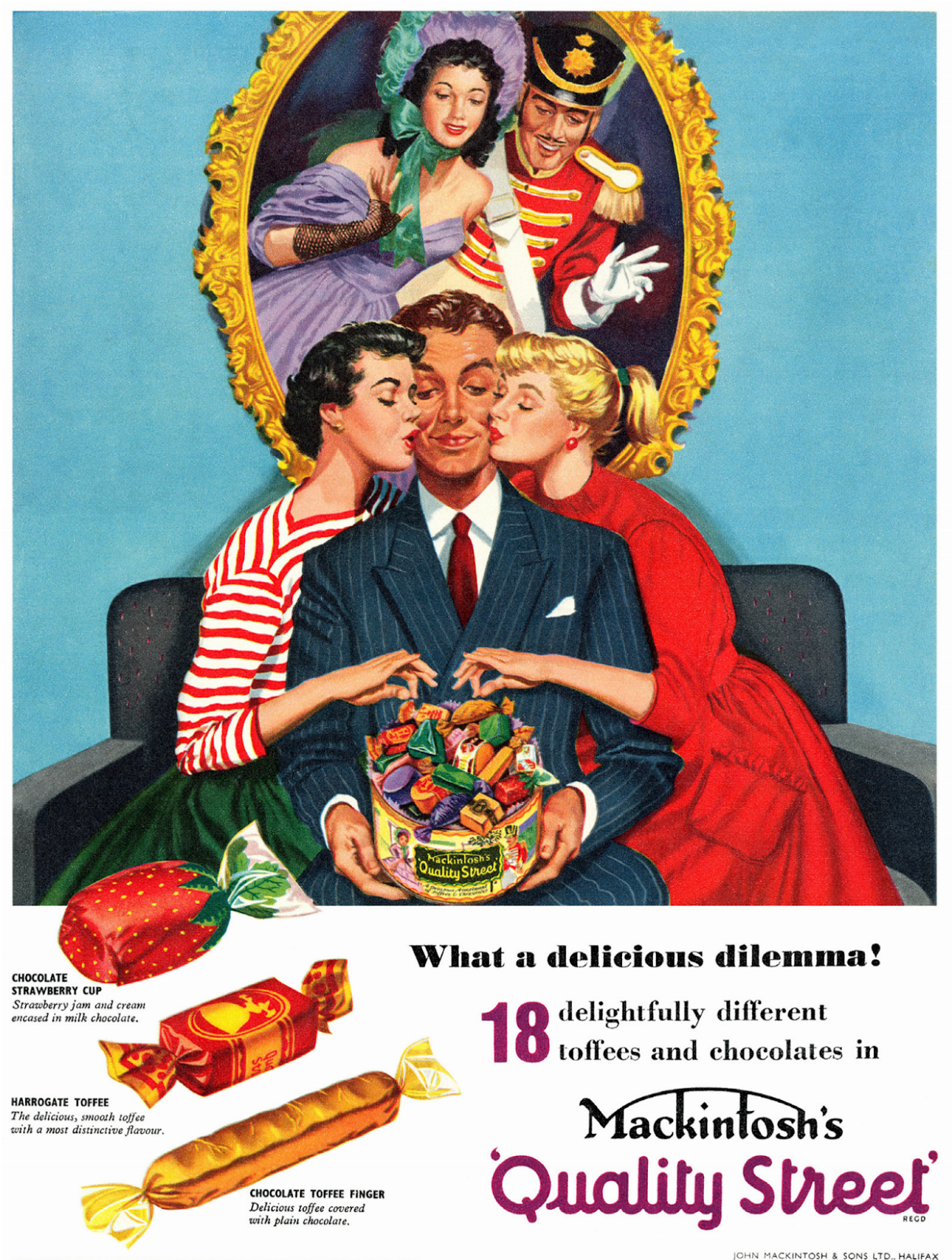
Structure and design ---> There is a very large image which is in colour which shows the popularity of the product/brand
They are dressed as the same colour of the sweets could suggest that women are seen as objects and also shows how women were sweet
Male hero choosing between two damsels in distress (Propp's theory)
Females choosing the chocolate
The man is wearing a suit which suggests the formal nature of his dilemma
Gold frame with the two people inside
Connotations of the gold frame make a halo effect around the man and product
Triangular composition of the poster
Product takes central framing
Everyone in the image are looking at the sweets showing how good they are
Typography ---> There isn't much text, and the little text that there is has images to draw the audiences attention to the product and it also shows how well known they are since they don't need to include a lot of writing to interest people. This is anti-stereotypical for advertisements at the time
Mixture of serif and sans serif fonts. The font would want to be more modern to show how the fact that these are available to everyone which was more modern at the time
The logo is the largest on the page which highlights the brand and it is quite unique. It is purple which often connotes to luxury, royalty and also links to the brand identity
Hand drawn, artistic nature of the design
Persuasive language techniques ---> They use alliteration such as 'delightfully different' and 'delicious dilemma'
Emotive language
The word 'dilemma' could link to not being able to choose out of the 18 chocolates they offer. Or which of the women does he want
Wednesday 10th January 2024
Historical Advert Set Text
LO: To explore the context and representations in the historical set text.
Do Now:
1. The two women love the man in the centre of the image but he isn't bothered with either of them as he is more interested in choosing from the sweets
2. Quite a rich life as they have a tin of chocolates which would have been quite a luxury
3. They could be trying to show that their product worth buying because there are many different ones to choose from. This could show that they are unique and a one of a kind brand since they include so many types. They could also be showing that because there are so many flavours, there is something for everyone showing how they are inclusive they are
The 1950s:
- Saw a change in 'high culture' where entertainment and the arts became more accessible and affordable for everyone.
- The post war culture of strict rationing and state control was coming to an end and the new government set to increase individual freedom
- Items that had only been seen from a distance during the war time was then more widely available
Advert 1:
- They are their to do housework for the men ---> aimed at men as the men would by the product for them since they earn the money
Advert 2:
- The women are expected to cook and the fact that it says ' that's what wives are for ' it shows how they are regarded as important only to do that thing
Advert 3:
- In this advert the women is rearranging the flowers whilst watching the husband and kids showing how their role in society was to watch over and care for the house and family
Advert 4:
- That they were seen as only being able to do one thing and that they should stick to that thing and ' stay where they belong '
Advert 5:
- Suggests that women should serve the men and respect the fact that they always look well dressed
Advert 6:
- Suggesting that women are perhaps weak and get emotional over small things
- Also suggesting that the men have the power and show it by comforting the women
In the 1950s, women were objectified and were there for the men. The people in the 1950s had stereotypical gender roles, such as the women stay home and do the housework and take care of the children whilst the men went to work. The adverts show the women as serving on the men which shows how they were seen as objects rather than real people which dehumanises them.
In the quality street advert the man is in the centre of the image showing how it was a male dominated society. He is also holding the tin of sweets showing how he is superior to the women. The women are dressed as sweets showing how women were often objectified. The women are also wearing dresses which shows how they were expected to be very feminine.
The man is framed in the centre of the advert, controlling the situation ---> Suggests the mens superiority and it shows how the community would have male dominated, emphasise his superiority
The women in the advert are both dressed like sweets and kissing the man as they reach towards the chocolate tin in his lap ---> suggests how the women perhaps rely on the man to give them the luxuries that they want. Also shows how the women are being objectified and made to look like the sweets
The mans costume is a suit which has connotations of the modern businessman ---> Shows how they were always well dressed and they earn the money to support the women
The man is looking down at his lap where the product he is holding is purposefully placed. This is a ' phallic symbol ' ---> This suggests that the man isn't bothered for either women as instead is too busy choosing a sweet for himself. This shows how the women were often seen as people to work in the house instead of for who they are
Friday 12th January 2024
Historical Advert Set Text
LO: To explore the possible exam style questions for advertising.
Do Now:
1. The quality street advert is male dominant
2. The man is in the centre of the image, he is the one holding the tin of sweets showing he has possession over the item, he has 2 women either side of him both interested in him
In the Quality Street advert, men are shown as being superior to women and this is presented by the male character being in the centre of the image. He is also the person who is holding the tin of chocolates which shows he has overall possession of them. The women are dressed to look like the sweets and so by doing this they are objectifying women which links back to the male gaze theory. They are both reaching into the tin which he is holding which could suggest that women must rely on the men to give them what they need or want. The interaction between the male and female characters is significant because it links to the anchorage text used. The text reads ' a delicious dilemma ' which could be viewed in two different ways. One way of seeing it is that the man has the choice of two women and yet he is only interested in the sweets, which again shows how women are expected to be loyal to men despite the fact they may not feel seen or heard themselves. Another way in which this could be seen is by the variety of flavours Quality Street have to offer. The word dilemma shows how there are so many to choose from that they can't decide.
The amount of sweets they have to offer also suggests that these are for everyone. In the 50s, chocolates were often seen as a luxury but Quality Street have made these for all of the people. We can see in the image how the two people in the portrait could represent the higher class and the two women represent a lower class and how the man is somewhere in between. This shows how their selection of sweets have brought all of the different people with a different social status together.
Homework:
Explore how the advertisement for quality street uses the following elements of media language to create meanings:
- Images
- layout and design
- language
In the quality street advert, the male character is placed in the centre of the image in order to emphasise his superiority. This shows how in the 50s, society was male dominated. The man is wearing a suit and a tie which connotes wealth and shows his status. He is also the person in the image who is holding the tin of sweets showing how he has possession of them and that they belong to him. In the 50s, chocolates were considered a luxury and so the fact that he has them again shows the importance of men. The logo is coloured purple, which can be associated with royalty and luxury. Either side of the man are 2 women, both kissing him and reaching into the tin which could suggest how in this period of time it was common for the women to 'rely' on men to give them what they need or want. This is also significant because it shows how both of the women are interested in the man and yet he isn't bothered by either of them. However, this could also link to the anchorage text 'a delicious dilemma' which could be seen in 2 different ways. One way of viewing this would be that he has the choice of either women or another way is that he has the choice of any of the wide range of chocolates they have to offer. The variety of sweets show how the brand is inclusive and that there is something for everyone. This is also shown by the characters in the main image by including the different social classes within it. The 2 people in the picture frame represent a high class in society and the women represent a lower class. The man would be somewhere in between; not as high up as the people in the picture frame but a higher class to the 2 women. The fact that quality street have done this in their advert, challenges the stereotypes and shows their product to be affordable to all which would interest more people. In this advertisement, the women are dressed as the sweets which links to the male gaze theory and how they have been objectified which overall dehumanises them. They are also wearing dresses which has connotations of femininity.
Wednesday 17th January 2024Analysing Adverts
LO: To build the skills needed to analyse and evaluate adverts.
Do Now:
Connotations - The ideas that we associate with a specific colour, image, text.
Denotations - The literal meanings of the colour, image, text.
Advert 1:
- The soldiers stood in front of the computer can connote safety. The advert is trying to show how their product is safe and can ensure security.
- This links in with the anchorage text reading 'UK's safest broadband'
- Neon glowing suggests new technology
Advert 2:
- The main image looks as though it is placed on a red velvet bed which has connotations of luxury
- They are saying that their product is luxurious and worth buying
- The logo
- Comparing it to a women
- The phrase underneath says 'are you mac enough'. This sounds like the phrase 'are you man enough'
Advert 3:
- The text that says 'a sporty car filled with history' links to the main image because the car in the image has been split in half and inside are older cars
- Connotations of the number 1 shows they are the best
Advert 4:
- They have used the hulk's hand to emphasise the strength and and durability of their plasters. The hulk is often seen to be incredibly strong showing how good there plasters are
- The hulk is popular and so would appeal to more people such as children as well as adults
Positive: Negative:
- inquisitive - nosy
- interested - crippled
- curious - handicapped
- disabled - retarded
Friday 19th January 2024
Persuasion in Adverts

Direct Address - This is used to encourage the audience and readers to buy their product since they are making it seem as though they are personally addressing you when talking about their drinks they have for offer.
Facts and Statistics - They have used the dates and times in which the offer is available in order to inform people of when they can use this offer and buy the drinks for less than the original price.
Imperatives/Opinion as fact - They use the word 'enjoy' which is an imperative as it is telling you to do something but in a nicer way, however it could also be considered and opinion as fact because the fact that they are saying enjoy implies that their product is quite nice as people enjoy it. They also refer to it as a 'treat' which implies that this offer and the drink is something you wouldn't have very often and is a treat to have.
Persuasive Techniques:
- Rhetorical Question
- Repetition
- Alliteration
- Emotive Language
- Opinion as fact
- Celebrity Endorsement
- Hyperbole
- Facts and Statistics
- Direct Address
- Imperatives
Weasel Words are ambiguous words that are used to 'weasel' out of something. These are words like 'may', 'often' and 'somewhat'. These words enable advertisers to make claims without really promising anything.
The soup - This may be the perfect dinner solution for you
The bike - This bike might make you ride super fast.
Wednesday 24th January 2024Contemporary Adverts
LO: To understand the techniques used in contemporary adverts.
Do Now:
Females - attractive, beautiful, pink, housework, more emotional, wear makeup, creative, women are bossy
Males - handsome, blue, power, intelligent, confident, men go to work, men are direct
Car advert (Fiat):
1. Brand identity
- lighthearted
- inclusive
- old school look
- different
- modern
-
2. The advert is laid out in the style of a magazine which could suggest that instead of trying to inform people they could be trying to promote their product. The advert looks almost like a fashion advert which suggests the importance of the style.
3. They are describing their cars as interesting and something worth having. They mention the luxuries their cars include and which again shows they are worth having. The fact that they are describing cars as something you would wear links into the stereotypes that women sometimes concentrate on fashion and how they look. The fact that for the advert aimed at males they have said sport it up, emphasises the stereotypes for men as they are shown as being passionate about sports. In the paragraph on the advert for males they have said 'dirk has really taken a shine' which shows that if he can like this car others may also like it, which encourages people to want it. The font could make their brand seem up to date and modern since they have used a sans serif font. They have also used capital block letters which makes it stand out especially on the dark purple and teal backgrounds.They have used a Z format which encourages the audience to read from left to right. So by doing this they have the largest piece of text be the first thing you read which will immediately draw the audiences attention to this specific advert. The Z layout also means their logo is on the right hand side at the bottom of the page which promotes their brand since it's the last thing you see.
4. The colours used on the adverts shows how gender has been represented. The advert aimed at males uses the colour of red for the car which can connote passion but red is also associated with strength which links to the gender stereotypes. On the contrary, the car on the female advert is yellow and the colour yellow is often associated with happiness and joy which could be to suggest that their cars will bring them happiness. He is more worried about the technical parts of the car and yet she is more concerned about the look.
Homework
This Girl Can:
- An award winning campaign launched in 2015 and funded by the national lottery.
- They want to tell the real stories of women who play sports or get active in a real way.
- The target audience may be any adult women of all ages.
- Their mission is to get girls and women moving and active regardless of shape, size or ability
Friday 26th January 2024
Creating Adverts
LO: To use our understanding of advert conventions to create advertisements.
Do Now:
- Anchorage text
- Image of the product being advertised
- Colourful
- Persuasive language (imperatives, facts and statistics)
- Brand logo/name
- Sans serif font to make it seem modern and up to date
- Slogan
Persuasive sell line 1:
Do you want the perfect solution to the rain?
Slogan:
Clip, dip and drive
Persuasive sell line 2:
Safety bacon!!
Weasel phrase:
This might just change your life...
Celebrity:
Brad Pitt
Wednesday 31st January 2024
Women in Advertising
LO: To evaluate how women are represented in a variety of adverts so that we can apply this to the set text for the exam.
The data shows us how a lot more of the girls don't feel as confident about trying new things because they worry or are afraid of being judged. However we can see that everybody in the group enjoyed PE even if they aren't that interested in sport and they quite liked participating in the activities. The data suggests that fewer girl prefer to watch sport.
- This girl can is a national campaign launched in 2016
- It was developed by Sport England and funded by the national lottery, this means that there is no commercial aspect, this means there was no intention to make any money
- The purpose of the campaign was to break down the primary barrier holding women back from sport, the fear of judgement
- Before the campaign, research showed that there was a massive gender gap of men and women participating in sport, with 2 million fewer 14-40 year old women than men partaking in regular sport activity
- 13 million women said they would like to participate more
- Just over 6 million of these were not active at all
- The fear of being judged was the number one barrier for most women who felt they were unable to participate in physical activity
- As a result of the campaign, 1.6 million women have started exercising and the number of women playing sport and being active is increasing faster than men
The message these mantras convey to women and society is to not be afraid of how you are viewed by others because as long as you are enjoying yourself and doing something that is going to benefit you in a positive way it shouldn't matter to others.
'I'm slow but I'm lapping everyone on the couch' ---> I think this is a very powerful one because it is saying despite not being the fastest person at cycling or whatever sport they are participating in, at least they are making an effort and trying for themselves
'Hot and not bothered' ---> They are saying that they are trying hard but they aren't bothered by how other people are going to see them. That they are doing it for themselves and aren't afraid of being judged
Advert 1: (Nike)
- Women are being represented as strong, as she is climbing a rope and could also be showing her perseverance
- They are quite young
- They are wearing a sporty outfit showing how they are motivated to try hard
Advert 2: (Nike)
- They have used someone of a different ethnicity in order to be inclusive which demonstrates how exercise is for everyone
- She has been portrayed to look sweaty because it shows her motivation
- They have used a shot where it is implied she is still running showing how women never give up
Advert 3: (Adidas)
- She is a professional track runner, running for Great Britain with a serious face, demonstrating that she is prepared and going to win
All the adverts fit the stereotypes of being slim and physically fit.
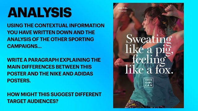
There are many differences between this poster and the other adverts we have looked at. One of these is that women are being shown as active and motivated but in a more realistic way which allows other people to relate and feel more comfortable doing sport activities without feeling judged. However, on the other adverts women are represented as being quite stereotypical because they are shown as being slim and physically fit. The quote 'sweating like a pig, feeling like a fox' could suggest despite they are quite hot and they are sweating, they're feeling quite good about themselves. They aren't wearing a 'traditional' sporty outfit either which makes it easier for people to relate because they are wearing a tank top and leggings which are more common for other people within the wider audience who will see this. They may suggest different target audiences because this one could be aimed at all types of women of any age, however the other ones are more aimed at professionals and people who are already on their 'journey'.
Friday 2nd February 2024
Advertising Set Text 2
LO: To analyse the construction of the this girl can set text.
Do Now:
The advert targets a wider range of women than just the this girl can poster because not only do they show a variety of different sports but they are very inclusive by having women of different ethnicities and ages in their advert.
Connotations:
Sweat - motivated, working out, disgusting
Pig - Cute, energetic
Fox - Cunning, beautiful
They have used the phrase 'sweating like a pig, feeling like a fox' because they are saying that if women exercise then you are going to set but you will feel good about yourself afterwards. By flipping the negativity and making it a positive, it is more likely to inspire women to want to take part in sport activities while feeling comfortable at the same time. The this girl can campaign was created to change the stereotypes that women don't like sport and so by including this phrase they are challenging these stereotypes.
Typography:
The serif font is used because it is a more feminine looking font and the target audience is women. It also allows you to see the image behind more clearly.
Main Image:
Centred mid shot - We are meant to pay attention to her upper body and what she is wearing, and also we can see her face and how it looks as though she is enjoying herself
Not a female celebrity but a women in her 30s - To encourage women to support the campaign and realize that sport is for everyone and not just certain people
Hair scraped back in a scruffy ponytail - To show how she isn't afraid of her appearance and how people are going to see her and she is more concerned about what she is doing than if people are going to judge her. This might make other women feel more comfortable with their own appearance
Sweaty/no or minimal makeup - hows again how she isn't bothered about her appearance
Workout/active-wear - She is wearing comfortable clothes in order to do something that she likes. The colours make the advert stands out
Eyes closed with a slight smile - Shows how she is enjoying herself and that she is happy and the fact that she has her eyes closed could suggest she is having fun
Active Position - She is motivated to keep trying which challenges the stereotypes that have been created about women not doing sports
Other women in similar positions in the background (out of focus) - Shows how it is for everyone but also the fact that they are out of focus draws the audiences attention to the main person in the image
Additional Media Language:
They use the hashtag to connect women and have a sense of togetherness. But it also immediately makes people think about social media which links it to the youtube advert.
Comparisons:
Similarities - They are both adverts that are inclusive as the products/messages are for everyone and not just certain type of people. They both use the anchorage text/mantra to emphasise the message/item they are trying to promote and entice the audience to their adverts.
Differences - The quality street advert objectifies women and views them in a negative way however the this girl can advert they are trying to encourage women to be themselves and do what they love to do despite what anyone else says. The quality street advert is a commercial advert whereas the this girl can advert is non commercial.
Wednesday 7th February 2024
Representation and Theory
LO: To explore the representations in the set text and apply relevant theory.
Do Now:
The this girl campaign's intention was to inspire women of all ages and encourage them to take part in sport activities without worrying about being judged or feeling unsafe.
Dominant Ideology - The attitudes, beliefs, values and morals shared by the majority of the people in a given society.
UK - Liberal-democratic
Cornwall - Pasties (?)
Campaign Agenda:
Encourage women to participate in physical activities by challenging the dominant ideology about women's relationship with exercise
- The dominant ideology is that women cannot exercise because they are too weak or too precious. A lot of people believe that women cannot exercise if they don't look stereotypically 'perfect', or that they cannot work out without judgement. A lot of people see women as unwilling to deal with the consequences of exercise and therefore just being unwilling to exercise in the first place.
- They seek to challenge this through their adverts by using everyday people rather than celebrities and models to show that exercise is for everyone even if you don't look stereotypically 'perfect
Challenging stereotypes:
- Stereotypically, women have often been thought of as the 'weaker' sex and often less successful where sport is concerned
- I don't think that this is true because women are just as good as men at sports. Yet despite the fact that we have come a long way throughout the years at becoming more inclusive especially considering sport, I still think we have a way to go.
- The ideology was challenged by...
1. Her facial expression creates a positive feeling for the audience because it makes her look as though she is enjoying herself which will therefore inspire other women to want to take part in sport so they can enjoy themselves too
2. The advert is trying to encourage women to see themselves in the person they have chosen because she looks as though she doesn't care about what others think of her and she doesn't look like the stereotypical 'active' person. She is also wearing quite common clothes for her outfit choice making her even more relatable.
3. The campaign and the advert itself is successful because they are being inclusive to all types of people. The word 'girl' isn't targeting anyone in particular and could refer to anyone of any age, size, etc. The word ' can' has suggests a certainty like it is possible if you put your mind to it.
Theory:
- Laura Mulvey came up with the male gaze theory. The male gaze theory is a sexualised portrayal of women. By objectifying women, the male gaze represents women through the sexual desires of heterosexual male viewers. It depicts the female body and personality as an object for men to view, own and conquer.
- I don't think we can really apply it since the advert and the campaign isn't aimed towards men, however we could talk about how the adverts contradict this theory since they show women enjoying themselves and not looking stereotypical.
Theory: Propp
Vladimir Propp: Narrative character roles/functions
He says - 'There are a variety of key character roles that appear in almost every narrative
The hero - Emmet, Wyldstyle, Vitruvius
The Villain - Hans, The Duke of Weselton, Lord Business
The Donor - Dobby, Mcgonagall, Snape
Hero, Villain, Princess/Damsel in distress, father, donor, helper, dispatcher, false hero
- He also says that these characters are involved in a series of different stages/functions or actions with narratives
-For example, the hero is dispatched on a quest, the villain tries to stop them in their path, the donor gives a useful tip/tool
Friday 9th February 2024
C1 Section A PPE
LO: To practice how to answer exam style questions effectively.
Do Now:
- Strength
- Challenging stereotypes
- Powerful
Question 1 - This Girl Can
Explore how the print advertisement for This Girl Can uses media language to create meanings:
a) text/written language
In the This Girl Can advertisement they have used media language to show how women are determined and not afraid to challenge the stereotypes that have been given to them. They have used the phrase 'sweating like a pig' which can often be associated with something quite disgusting or dirty. However, they have continued this with 'feeling like a fox', which has connotations of being quite beautiful which suggests that if you exercise you will feel good about yourself afterwards. These two similes juxtapose one another in order to flip the negativity of the first phase and make it into something positive. This is therefore going to inspire women and encourage them to want to take part in sport. The This Girl Can campaign was created to change the stereotypes that girls don't do sports and so by including this phrase they are challenging those stereotypes.
They have included their logo underneath this phrase to emphasise what their campaign does. The noun 'girl' doesn't target anyone in particular which shows how they are inclusive and also illuminates the fact that sport if for everyone not just the 'stereotypically active' or just for men. They are showing how women of any size, age, ethnicity, etc can take part in sports without feeling as though they don't belong. The word 'can' suggests a certainty, like it isn't a maybe or a possibility, they are showing with absolute certainty that sport is for everyone and anyone can participate if they put their mind to it.
b) visual codes (for example:images, lighting, dress)
The This Girl Can campaign aims to change the stereotypes that have been created overtime and to inspire women to want to participate in sports no matter who they are.
In this advert, the women in the main image isn't a celebrity or an athlete which makes her much more relatable to the target audience this advert is aimed at. She has her hair scraped back into a messy ponytail which emphasises how she isn't afraid of what other people are going to think of her or whether people are going to judge her but instead is their for her own happiness and joy. This contradicts the male gaze theory in which women are there for men to look at and to be attractive and beautiful. By using this women in their advertisement they are making a point that you don't have to be stereotypically active or perfect at sports but instead doing something to make yourself feel good or or happy is much more important. This advert doesn't necessarily follow the typical conventions of print adverts, because often advertisements have models or professionals in their main images, however this advert focuses more on the campaign itself rather than what the main person looks like.
They have made the background of the advertisement blurred which brings to light the fact that she isn't worried or concerned about what other people are doing but is focussing on herself and no one else. This links in with the fact that her eyes are closed, as though she is in her own world and isn't interested in the world around her and that she is having fun. They have also blurred the background in order to show there are others there which shows it isn't something you have to do alone, it is again something for everyone. This also draws attention to the women in the main image and what she is doing. The fact that they have done this could encourage women not to be afraid of being judged and instead do something for themselves and no one else.
The clothes she is wearing in the main image aren't stereotypical for athletes but they are relatable which again shows how the campaign are aiming to be relatable. They suggest that she isn't afraid of being judged and she is also comfortable while doing sports which was another thing the campaign was aiming to show. This advert is a non-commercial advert meaning they aren't trying to sell a product but instead try to inform the audience of the message their campaign is trying to get across. This isn't a typical convention of most adverts because a lot of advertisements are produced for money or business purposes. However, this advert does follow the conventions of a non-commercial advert as they use both the written text and visual codes to convey their message.
Wednesday 21st February 2024
DIRT - C1 Section A PPE
LO: To revise how to answer exam style questions effectively.
PPE Q1a: 5/5
WWW: Excellent analysis - two clearly explained and supported points
EBI - nothing!
PPE Q1b:8/10
WWW: excellent focus on the meanings constructed by the visual codes
EBI: identify whether these techniques follow typical conventions for print adverts
Question 2
a) Explain how political contexts influence magazines. Refer to Pride magazine to support your points.
Homework
Explain how historical context has influenced advertising. Refer to the Quality Street advert to support your points.
The Quality Street advert clearly shows how historical context has influenced advertising in many ways. To begin with, in the 1950s, women were viewed as inferior to men and seen as less by many which is reflected in the advert since the man is in the centre of the image showing how the focus is on him. He is also the one who is holding the container showing how he has the power in the situation which could represent how society was patriarchal at the time. Either side of him are two women who are being objectified, which is evident as they appear to be following the same colour scheme as the chocolates perhaps suggesting that they are sweet or innocent, but also suggesting that they are objects that are purely for the male gaze, dehumanising them again implying they are less, showing how the advert has been influenced by the beliefs in society in the 50s and the dominance of men.
In the advert, everyone is looking at the chocolates and nothing else showing the importance of them and how Quality Street are aiming to keep the focus on their product. In the 1950s,chocolate was seen as a luxury that often higher classes in society would have the privilege of enjoying, which is clear from the fact that the man is holding the container and the women are choosing, almost as if they are asking for the right to have the chocolates. However, on the other hand, Quality Street were attempting to create a selection of chocolates that could be afforded by all, and the fact that there are two men and three women, two of which are seemingly of a very high class in society, shows their ultimate goal of selling affordable chocolates for all of society not just the upper classes. This also reflects the changes in society and the developments regarding companies and products.
Homework
Explain how social and cultural context has influenced advertising. Refer to the This Girl Can advert to support your points.
There are many ways in which the 'This Girl Can' advert has been influenced by society at the time. When the advert was released, there was often a lot poof judgement surrounding exercise and many women felt nervous or anxious about exercising in public spaces such as gyms. The 'This Girl Can' advert addresses this fear by saying 'sweating like a pig, feeling like a fox'. These two similes juxtapose one another exploring how despite physically sweating and perhaps feeling disgusting, since pigs quite often symbolise something dirty or unsanitary, you yourself can feel beautiful and magnificent like a fox if you believe it is true. The two similes could perhaps also represent the choices a person has to make when exercising, how they view themselves, since they could either believe sweating is unsanitary or they could choose to see the beauty in exercise. The use of the similes on the advert encourage women to exercise if they want and not avoid it due to fear of being judged or looked down upon.
Another aspect of the advert that has been influenced by society is the woman herself who is wearing casual clothing. She isn't a model or a celebrity, showing that staying fit and healthy isn't just for those who are stereotypically 'perfect' or 'beautiful' but it is in fact for everyone who wants to take part. That is also supported by the name of the organisation, 'This Girl Can' since the noun 'girl' implies it is for everyone not just a specific age group or ethnicity. In addition, the people in the background of the image are blurred, emphasising the importance of focusing on yourself and not worrying about what others are doing or thinking about you and instead doing it for your own pleasure.


 emotive language - happiness


ADVERT AIMS & CONVENTIONS:
ReplyDeleteGreat notes
QS ADVERT:
Excellent notes and understanding of context, the use of ML & representation
QS HOMEWORK:
Fantastic ideas linked to the context. Well done!
THIS GIRL CAN ADVERT:
Excellent notes and understanding of context, the use of ML & representation.
PPE Q1a: 5/5
WWW: Excellent analysis - two clearly explained and supported points
EBI - nothing!
PPE Q1b:8/10
WWW: excellent focus on the meanings constructed by the visual codes
EBI: identify whether these techniques follow typical conventions for print adverts
CONTEXT HWK #1
ReplyDeleteFab - spot on!
CONTEXT HWK #2
Excellent - well done!