Magazines C1A
Wednesday 6th September 2023
Introduction to media representations
LO: To explore the concept of representation and stereotypes.
Representation
- The media offers the audience an interpretation of the world.
- It is a RE PRESENTATION of the events, people and places.
I think that this is a positive representation because the advert is describing them as superhumans which is giving the people who have disabilities a feeling of empowerment. They are stood in a line and each person can be seen clearly. They are also stood in a strong looking position showing they are just as strong as everyone else despite their disabilities. Channel 4 is a mainstream channel meaning many people will see it.
Strong Brave
Empowered Focused
Invincible Un-typical
Confident Determined
Friday 8th September 2023
Do Now:
:max_bytes(150000):strip_icc():focal(742x118:744x120):format(webp)/hsmtmts-season-4-cast-080723-e63c02c06b9d44ddb823d60acf164d3e.jpg)
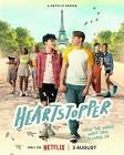
How have they used MES to create the stereotypes?
- They both have backpacks
- He is more of a technology nerd whereas she is more of a science nerd
- She has glasses
- Simple clothing like a shirt and shorts however still somewhat smart
- He has a bike
- He also asks if she wants to be his lab partner
- He looks very prepared
Stereotyped Expectations:
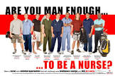
- Nanny - Floral dress with an apron, always smiling, handbag with things prepared (basically everything) and female
- Nurse - Blue dress with an apron around their waist, hair in a bun, with a face mask and gloves and female
- Teenager - Hoodie, joggers/leggings, always with their phone, staying in room, not really social, lazy and any gender
- Astronaut - Spacesuit, helmet, on the moon, obsessed with science, good person and male.
- Football player - In sports uniform, name and number on the back of their shirt/vest, holding a football and male
- Opera fan - posh, wearing ball gowns and fancy outfits, fancy possessions has front row seats at opera, looks down on others and any gender
- Teacher - Suits/dresses/simple outfits, glasses and any gender
- Tattoo lover - Many tattoos, shaved head, wears a vest top so tattoos are visible, strong and male
Educating the East End:
In this trailer, stereotypes are being challenged at the start of the clip. This is because it shows teenagers as very social and open with each other and the teachers, and the teachers are shown as being nice and friendly to the students. However at the end of the trailer the stereotypes are being reinforced as the teachers are shouting at the students and the students are shouting back and messing around and just generally not behaving. It surprises me that the students are friends with the teachers and that the teachers are friendly with the students. It also surprises me that the students are enjoying themselves at the school.
Wednesday 13th September 2023
Representations in Magazines
LO: To explore the representations found in magazines.
Direct Address - Where the model/celebrity is facing the camera and so is staring at you.
Star vehicle - The person in the main image
Cosmopolitan:
- It's aimed at younger women above the age of 18. We can see this due to the colour choices (pink, purple, yellow).
- It is a magazine including health and money tips. We can see this from the cover lines.
- There is romance advice which tells us that this is included in the magazine.
Carrie Underwood represented:
- Confident
- Picture perfect
- Attractive
- Happy
Cover 1:
- Laid back
- Naturally beautiful
- Casual clothing
- Stereotypical normal life
- family oriented
- inexperienced mum
Cover 2:
- Powerful
- Talented
- Strong
- very successful
- elegant
Cover 3:
- Feminine outfit
- Confident
- Successful/wealthy
- younger/innocent
- appropriate outfit/modest
- regal
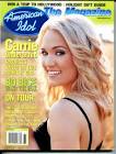 Represented as sweet, caring and someone who appreciates nature.
Friday 15th September 2023
Representations in Magazines
LO: To explore the representations found in magazines.
Differences between magazine covers:
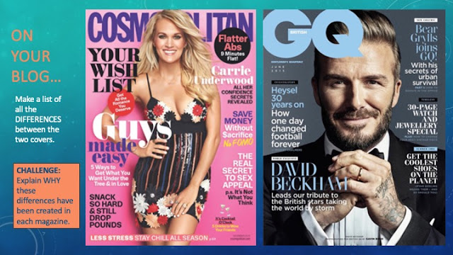
- They use different colour palettes which are more suited to the stereotypes based on the target audience (pink, purple) (blue, black)
- The one that is aimed at women includes puffs to draw your attention to the text inside
- Different shot types are used for a different effect
- On the magazine aimed at women, the main image goes over the title whereas the one aimed at men has the masthead covering the main image
- The genre is different
- The outfits choices are different, Carrie Underwood is wearing more of a revealing dress whereas David Beckham is wearing a suit
- Busy layout for younger women/organised for middle aged men
In the Cosmopolitan magazine, it has been made feminine by including cover lines such as saving money, romance and weight loss which are stereotypically things women would be interested in reading. In the GQ magazine, the cover lines are about football, fashion and watches/ jewellery which are things that are stereotypically masculine interests. On the magazine meant for women it mentions a lot about guys and how to impress them however in the magazine meant for men it doesn't mention anything about women.
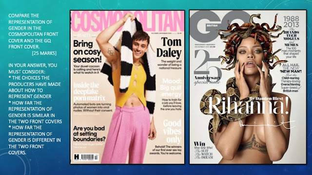
- In the GQ magazine Rihanna is represented as dangerous and isn't wearing an outfit.
- The colour scheme on the cosmopolitan cover are often colours stereotypically thought to be feminine whereas the colours used on the GQ cover are stereotypically masculine
- Feminine clothing which could represent LGBTQ+
- Mythical theme with medusa vibes
- The star vehicles name is in a different place on the cover
Wednesday 20th September 2023
Exam Style Magazine Question
LO: To write and structure an effective exam style answer.
Cosmopolitan
- Anti stereotypical use of male cover star
- Stereotypical representation of a gay man (pink, style)
- Stereotypically female topics (relationships, sex, men)
- Anti stereotypical topics (jobs, porn)
- More feminine representation of a modern woman (independent, strong, openly sexual)
GQ
- female cover star for magazine
- sexual objectification
- Negative female representation (snakes, medusa)
- Stereotypically male topics
- Muted colour palette
- More updated representation of the modern man (?)
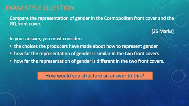
The two covers represent gender very differently.
Cosmopolitan represents Tom Daley in an anti-stereotypical way. For example, he has been dressed in more feminine clothing both in colour and style. The specific outfit he is wearing is a crop top that is quite revealing and pink trousers which would most commonly be worn by women. However, for a gay man this is more stereotypical. On the other hand, there are more stereotypically masculine representations with the tattoo and the muscular physique. The cover lines include feminine topics such as relationships and tips. This is stereotypical for a feminine magazine however seems anti-stereotypical for a magazine with a male star vehicle on the cover. The cover lines could be representing a more feminine representation of a modern woman also using the colour palette of pink and yellow which are often associated as female colours.
GQ represents Rihanna in a negative way, she has snakes surrounding her which suggests she is quite dangerous and you should be fearful of her. This could also link to mythology and the character of medusa, who was a gorgon. Medusa was very vein and so was turned 'ugly' with snakes making people fear her. This could suggest that Rihanna is quite arrogant and vein which isn't a positive representation of her. The GQ magazine also has masculine themed cover lines and Rihanna in this picture isn't wearing any clothes which could be stereotypical for a masculine magazine due to the male gaze. The way she is positioned is so it can be easily seen that she also has a tattoo which is considered an anti-stereotypical thing for a woman to have therefore giving her more masculinity. The cover of the GQ magazine also uses a muted colour palette which could be to express that the GQ magazine is often aimed at older men.
The magazines are similar in the sense that some of the components used in both magazines are anti-stereotypical for what they're known for. For example, GQ usually talks about masculine topics, but has a female on the front cover, just like cosmopolitan is known for talking about feminine topics, but has a male cover star. They are both also stood in a specific position (whether that is having his arm holding something up in the air, or her holding her hands towards her face making it obvious that her tattoo is on her waist) in which you can easily see their tattoos. Another thing that they both do similar, is that both of their star vehicles are using direct address to make it seem as though they are staring straight at you, which draws your attention to that particular magazine.
However the way in which the two cover stars have been portrayed is completely different. The cosmopolitan magazine represents Tom Daley in a positive way. On the contrary, Rihanna is portrayed in a very negative way.
Friday 22nd September 2023
Representation
LO: To create magazine covers showing an understanding of representation.
Wednesday 27th September 2023
Friday 29th September 2023
Exam Style Magazine Question
LO: To review and improve an effective exam style answer.
WWW: you've compared both covers well and included gender stereotypes and accurate terminology
EBI: include more specific examples in your answer
Homework:
Find a cover of GQ magazine (please choose one we haven't done in class). Add it to your page. Underneath, analyse how gender has been represented on that cover.
Write in full sentences and mention both the image and the lexis (word choice).
Extension: Add in anything that the cover shows in any other area of representation.
Industry Research
LO: To research companies linked to set products.
Magazine Industry Definitions:
- Circulation - the average number of copies of a magazine distributed by the publishing company
- Advertising revenue - the money that a magazine earns from putting paid advertisements in their magazine
- Cover price - the price of the magazine that is displayed on the front cover (how much the magazine costs)
- Subscription model - when customers pay a recurring fee to keep getting regular copies of the magazine
- Multi-platform - the act of using 2 or more media platforms at the same time (physical, online)
- Readership - the average number of people who regularly read the magazine
- Ideology - a set of beliefs and values shared by a group of people
- Brand identity - the visible elements of a brand that identify and distinguish the brand from others (colour, design, logo)
- Target audience - a specific group the product is aimed at
GQ:
- The magazine was launched in 1931
- The original genre was a men's fashion magazine for the clothing trade
- It was aimed primarily at wholesale buyers and retail sellers/fashion industry
- Over the years new topics were introduced such as articles that went beyond fashion and established GQ as a male magazine. It used to be called Apparel Arts and then changed to Gentlemen's Quaterly which was then shortened to GQ in 1967.
- Condé Nast publishes GQ
- GQ is a multi-platform company (there is an app you can download, there is also a website, a physical copy)
- The average circulation for 2022 was 85,080/ the average readership for 2022 was 212K
- The target audience is men aged 20-44
Summary of brand image -
GQ covers topics such as fashion, watches, fitness and lifestyle. GQ is dedicated to bringing its multi-platform audiences the very best in investigative journalism. GQ has also won over 50 awards for its magazine, website, social media and video content. The greatest magazine around. The men's magazine with an IQ. Whether it's fashion, sport, health, humour, politics or music, GQ covers it all with intelligence and imagination.
Vogue:
- The magazine was launched in 1892 in New York/British Vogue was launched in 1916
- The original genre was a high society diary until Condé Nast bought the company in 1905, who made it into a women's fashion magazine
- The original audience was the social elite
- In 1909, the target audience was changed form the social elite to women. The creators of the magazine have (over the years) played around a lot with the masthead. It went though many changes until they finally settled with the current design.
- Condé Nast publishes Vogue
- You can read the magazine online wit a vogue subscription. The app is also free to download, however subscribers get unlimited access
- Their average circulation for 2022 was 190,249/ their average readership for 2022 was 796,000
- Their target audience are 17-29 year old women and teenagers. ABC1 fashion and style conscious women who are educated, sophisticated
Summary of brand image -
Vogue is classed as a glossy, monthly, women's lifestyle magazine. British Vogue is the authority on fashion, lifestyle and is a destination for women to learn, be challenged, inspired and empowered. Vogue is a feminist magazine and they have (for over a century) embraced creativity and craftsmanship. They have many issues that have had many articles on critical issues of the time. Vogue looks to the future with optimism, remains global in its vision and stands committed to practices that celebrate cultures and preserve our planet for future generations.
Wednesday 4th October 2023
Friday 6th October 2023
A
B Educated, professional, high earners
C1
C2
D
E
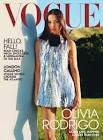

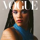
They showcase the brand identity of empowering women by using cover stars who are popular and successful. The star vehicles are people who have been quite influential and inspiring recently whether thats on the internet or in another way.
The middle picture shows someone with their head held high, showing that even if you are disabled you can still be who you wanna be which adds to the brand identity of women being empowered.
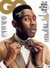

These magazine covers from GQ show their brand identity by making the cover stars look intelligent and fashionable. The suits they are all wearing look expensive and posh clothing but also look intelligent which could represent the target audience being upperclass men.
Each cover star is holding an item of clothing such as the bow tie, the regular tie and glasses. This is to draw the readers attention to that item.
Case Study 1
Wednesday 11th October 2023
Case Study 1 - Raheem Sterling GQ
LO: To explore the context and cover star for case study 1
Do Now:
1. GQ: Fashionable, Intelligent, Lifestyle
2. Vogue: Empowering, Confident, Creativity
How could we compare these two covers using information from the previous slide?
We can compare them by how gender has been represented in each. David Beckham has been represented as intelligent (which links to the "men of the year") which can be seen by the suit he is wearing and way in which he has positioned his hands. However, Jennifer Lopez has been sexually objectified as though her only purpose is to be viewed by men. This adds to the male gaze as she hasn't got any clothes on and instead wraps a towel around herself. This also makes it seem as though women are only being praised for how they look and not their talent and skills. Whereas men are portrayed as intelligent which is awarding them on their skills.
How does GQ target its audience?
GQ targets the adult men by using cover lines that would be appealing to them. These include topics like fashion, survival and sport but also many cover lines about women. These include cover lines that talk about women in relationships, female singers/artists.
How does GQ represent gender?
On the GQ magazine with Jennifer Lopez, one of the cover lines says "More proof that God is a man" which suggests that women don't have the intelligence to lead. It also suggests that women possibly aren't good enough because God is someone who is thought of very highly and people believe in him, but the quote kind of says that women don't deserve that right.
Friday 13th October 2023 (Quote)
Typography:
- Typography is anything to do with the look of the text (font - style, block capitals/lower case, colour, italics/bold, size)
Masthead - Using a sans serif font could suggest that GQ are up to date with the more modern style. This could also link to their content of the modern man.
Cover lines - Using a sans serif font and the letters are in block capitals. The font could be used to tie all of the text together on the magazine. The block capitals are used because block capitals are associated with masculine themes and have masculine connotations.
Main Cover Line (star vehicles name) - Using a stylised font which is still sans serif could suggest that they are trying to get your attention. Also a part of GQ's brand identity is creativity so by using a stylised font it could be presenting GQ's brand identity on the magazine cover.
Colour Palette (grey, black, white, silver) - The colour black links to the suit he is wearing and connects the cover lines to the main image. The colour white is used for the masthead and the colour of his shirt which is kind of hidden. The grey is used as the background colour and it's more of a dull colour making the other stand out.The silver is the accent colour, which is very bright to draw the readers attention to the name.
Layout - This magazine uses a Z shape however it is not immediately obvious. The cover is quite simplistic and bare so the Z shape isn't immediately recognisable, but it is the pattern in which we would read the lines on the magazine.
Anchorage Text:
- Signs can have different meanings so producers will try to direct the audience's interpretation towards a preferred reading of a media text by using anchorage. Photographs are often accompanied by captions which are used to fix their meaning.
- 'The boundless mind of Chiwetel Ejiofor' is the anchorage text. The producers are trying to direct their audience to think that Chiwetel Ejiofor is a very innovative and creative thinker. By saying he has a 'boundless mind', they are saying that there is no barrier to his thinking.
Image:
Medium long shot - focuses on both facial expression and outfit choices.
His stance - Could show he is at ease. However, his facial expression and outfit are juxtaposing this.
His facial expression - Looks quite thoughtful which links back to the main cover line of him having a boundless mind.
-His outfit - Makes him look quite professional and the outfit looks expensive showing he is serious.
Homework Task: Research
Find out at least 5 facts about cover star, Raheem Sterling. (up to 2019).
Raheem Sterling
- born December 8th 1994
- He is an English professional footballer who plays as a winger for Premier League club Chelsea and the England national team
- In July 2015, he was signed by Manchester City in a transfer potentially worth £49 million, which was the highest transfer fee ever paid for an English player at the time
- He helped Manchester City win back to back Premier League titles in the 2017-2018 and 2018-2019 seasons
- In the 2018-2019 season, he won the PFA Young Player of the Year and FWA Footballer of the Year
- Raheem Sterling made his senior debut for England in November 2012
- He was arrested in 2013
- He was the fifth youngest player to represent England when playing against Sweden in 2012
- In December 2018, whilst playing against Chelsea, Sterling was subjected to racist taunts from Chelsea fans
Wednesday 1st November 2023
LO:
Do now:
The colour palette is white, black and a bit of pink.
They have used a sans serif font which could show it is more modern and new.
The accent colour of this magazine is silver, which is used for their name drawing the readers attention to the cover star.
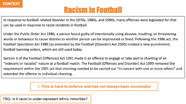
After hearing racist comments whilst playing a match against Chelsea in December 2018, Raheem Sterling felt the need to speak out about racism in football. At the time, racism was massive especially during football games and so it was unfair especially the fact that it still wasn't equal. Due to the fact that he was a young black footballer, this meant that people were still not supporting them and seeing them as equal. It says that racism is still not taken seriously which shouldn't be the case.
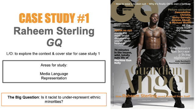
The masthead is in bold and uses a large sans serif font
The colour used is a deep gold, connoting wealth but also religion in the context of the rest of the cover
The colour gold is juxtaposing the black used in the wings, already implying there will be binary opposites on this cover
Subverting the stereotype that bags are only for women, now men can own and enjoy them too
Suits are common attire
Friday 3rd November 2023
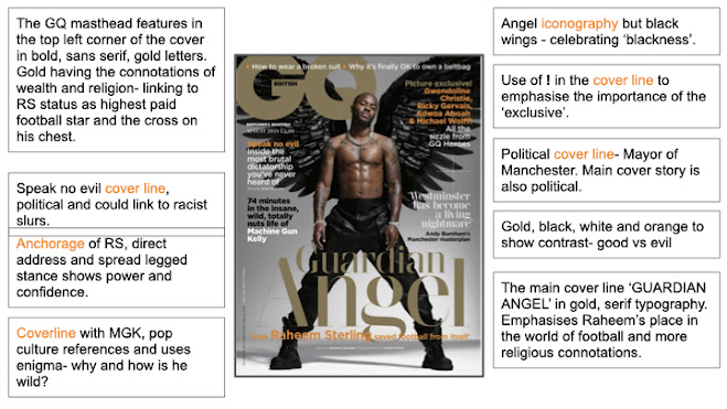
- He has tattoos which have connotations of being masculine and also has a six pack which could link to the fact that he is an athlete and therefore works out
- He has wings to imply he is the guardian angel of like football (as seen from the cover line 'how Raheem Sterling saved football from itself '). Protecting the other football players by speaking out about comments that have been made. (he is also religious) religious iconography
- Black can be associated with danger and evil which is the opposite of how GQ wants him to be portrayed in this magazine cover.
- Jewellery could connote his wealth and status
- Body Language - the way he is standing is a very masculine pose
Exam Question:
Explore how his front cover of GQ magazine uses media language to communicate meanings.
- images
- text/written language
- layout and design
On this GQ cover the star vehicle Raheem Sterling (RS) is represented as the 'guardian angel'. The religious ideology of wings implies he is an angel, protecting the other black football players from the racist comments by speaking out about his previous experiences. He is also religious so could link to his personality and the beliefs he has. The wings are black and so are his trousers, which can have connotations of evil and danger. This is the opposite of how GQ wants RS to be portrayed on this magazine cover. However, others may view this cover in a different way by seeing him as the devil or a dangerous person since the wings are black which is anti-stereotypical. He has tattoos which is considered more masculine, but these could suggest he is brave since he has been criticised before about having a tattoo of a gun on his leg. So by him showing off his tattoos it could suggest he is willing to stay strong despite the comments made. This could also be the reason he is topless in order to show his muscles.
The main cover line reads 'Guardian Angel' which is in gold, serif typography, which emphasises the idea of him being a protector and links to the main image of him. The 'speak no evil' cover line links to RS supporting those who have been commented on and show how he is against the racial slurs made by some people.
The colour palette used on the magazine are gold, black, white and orange which shows the contrast of good and evil which again links to the opposing views of the readers.
(25 minutes - not finished)
WWW: detailed, thorough & accurate
EBI: include more accurate magazine terminology
Wednesday 8th November 2023
Gender Representations:
- Men are being represented as physically strong and powerful
- Men are being represented as crazy as the cover line says "74 minutes in the insane, wild, totally nuts life of Machine Gun Kelly"
- Cover line that lists the "GQ heroes" has two females.
- The camera angle is lower indicating power
- Represents men as being political
Ethnic Representations:
- He is being represented as strong and powerful which is stereotypical
- Anti stereotypical for the magazine cover as the star vehicle is black
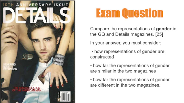
- Women are being represented as very sexual in this cover and portrayed in a negative way
- The "remasculation" suggests that men should become more masculine as though throughout the years they have changed possibly suggesting they've changed for the worse
Friday 10th November 2023
Do Now:
Gender representation
Men are being represented as crazy, powerful and as being political
Ethnicity is represented in a diverse way on this cover because Raheem Sterling is being represented in a positive light and they are being inclusive of lots of people.
Gender:
- Hyper masculine - exaggeration of masculine stereotypes
- Thick silver jewellery reinforces the capitalist ideology that for a man to be thought of as successful you must be wealthy and make a lot of money.
- All the men named on the cover are represented as successful in their own field, which conforms to the genre conventions of glossy magazines
- Societal expectation that they must 'have it all'- health, wealth and strength- and the image of Sterling supports this as he epitomizes all three.
Ethnic:
- Using a successful black cover star as their dominant image, GQ is presenting a role model for it's readers, someone to aspire to be like.
- He is a success on more than just the pitch; he is an influencer
- Diverse range of ethnicity on the cover is unusual for GQ and lifestyle magazines in general.
Representation (John Boyega):
- The cover star is John Boyega who is a very successful black actor and film producer. GQ is providing its readers with someone to look up to.
- One of the cover lines reads, 'John Boyega on standing up, speaking out and being sidelined in Star Wars' is a positive representation of ethnicity as its a black man speaking out about being discriminated against for being black. By having this cover line, GQ might inspire other people who have been discriminated against for their skin colour to speak up about it.
- There is a cover line that says, #black lives matter# which presents ethnicity in a good way as it shows that GQ are supporting the movement against discrimination and against people being killed because of their skin colour. It also shows GQ are modern and up to date as the magazine cover was released in 2020.
- Stereotypically male topics are on the cover
- The cover star has a very serious facial expression which could link to the cover lines especially the main cover line. The situation is very serious.
- Having his hood up has connotations of gangs and criminals and so he could be trying to challenge that stereotypes. The hood is white and the colour white can be associated with purity and positivity.
- Outfit is casual yet also shows his wealth and success. He cares about his appearance.
Case Study 2
Wednesday 14th November 2023
Case Study 2 Malala Yousafzai
LO: To explore the context and cover star for case study 2.
Do Now:
Vogue is associated with being a women's lifestyle magazine.
Their target audience are women in their 20s - 40s
Published by Condé Nast
Vogue is aimed at ABC1 fashion and style conscious women who are educated, sophisticated and wealthy.
Whilst it traditionally targeted an older female audience of 30-45 year olds, you could say that this audience has now broadened to appeal to, inspire and empower younger readers too, as well as a much more culturally diverse audience, under the influence of the new editor.
To appeal to advertisers, Vogue emphasises the wealth and status of its ABC1 readership who spend an average of £8,000 a year on fashion and over £1,000 a year on cosmetics.
Vogue is a mainstream magazine, so it uses the typical codes and conventions of print to construct the front cover. Over a long period of time, Vogue has also acquired its own unique house style so that its brand identity is instantly recognisable.
Historically, black and asian models were not featured as cover stars and were very under represented.
Harry Styles & Rihanna magazine:
- They target the audience by having cover stars such as Harry Styles and Rihanna who will interest younger women.
Represent Gender:
- The rings, outfit and the way his hair is styled connotes wealth and status.
Represent Ethnicity:
- Far more inclusive than it once was in the past
Malala Yousafzai facts:
- Malala is a Pakistani female education activist
- She was shot in the head in 2012 for opposing Taliban restrictions on girls going to school.
- She is an international symbol of the fight for girls education
- She flew to the UK for medical treatment
- She went to Oxford University and graduated with a philosophy, politics and economics degree.
Homework Task:
Compare the representations of gender in the Sterling GQ and Details magazines.
In your answer you must include:
- how representations of gender are constructed
- how far the representations of gender are similar in the two magazines
- how far the representations of gender are different in the two magazines
In both the GQ and Details magazine, men are being presented as stereotypically masculine and confident. On the GQ cover, the religious ideology of the wings presents men in a positive way making them seem powerful and all knowing. The cover star, Raheem Sterling, is shirtless with tattoos showing and it reinforces the stereotype of men having muscles and tattoos. He is also wearing black trousers and the colour black connotes evil and darkness which presents men in a negative way making them seem dangerous, which could link back to African Americans being represented as criminals and being violent. Raheem Sterling also wears lots of jewellery which connects to the thoughts that to be a successful man you must be wealthy and make lots of money. However women are also being represented on this cover as successful, as one of the cover lines lists famous celebrities who are successful in their own field of work, but they could be represented more on this magazine cover.
On the contrary, on the Details cover, women are being sexually objectified and not portrayed in a positive light. The cover makes it seem as though their only purpose is to be seen by men. However, Robert Pattinson is shown as stereotypically masculine, wearing a shirt and blazer. The anchorage text (?) reads 'the remasculation of the American man' which could suggest that men have changed for the worse over the years and they should go back to how they were.
Gender is represented in both a similar and different way in the magazines. They both show men in a stereotypical way but Robert Pattinson is portrayed as quite attractive however Raheem Sterling is represented as powerful and as though he's a protector. Women are shown as being provocative in the Details magazine but successful in the other.
Friday 17th November 2023
Malala Yousafzai is a Pakistani female, girls rights activist. She now fights for girls right to education. She was shot in the head in 2012 for opposing Taliban restrictions on going to school. She attended Oxford University and graduated with a philosophy, politics and economic degree.
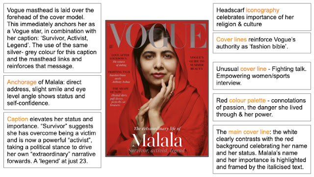
As a female education activist of Pakistani origin, Malala seems like an unlikely cover model for the fashion bible. The editor explains their choice: she is an inspirational figure who has achieved so much, against all odds, at such a young age.
Masthead:
- The same classic Didot font has been used for vogue since the 1950s. It is now known as the vogue font.
- They use the same colour for the masthead as they do for the 'survivor, activist, legend' cover line
Main Image:
- Direct Address makes her look confident
- They have used a medium close up which is anti-stereotypical for vogue as usually they have a long shot. This shows that vogue chose her as a cover star not for her body and physical appearance, but to be an inspiration for their readers and to share her story
- The colour red is used for both the background and her outfit which could represent the pain she has been through, and how much she has gone through to get this far
- She is wearing a headscarf which is what links to her religion and where she's from
- She is at a level angle with us: we are invited to get closer to her, to identify with her, but also admire her and look up to her as a role model, a legend even.
Anchorage:
- The main cover line is the brightest and largest text on the page. The white clearly contrasts the red background celebrating her name and her status. Malala's name and her importance is highlighted and framed by the italicised text. This offers a measured sense of symmetry with the masthead at the top.
- Layout is the Z shape which follows a traditional layout.
Cover Lines:
- 'Vogue's guide to summer beauty' - this is stereotypical for vogue since it is a fashion and lifestyle magazine for women/helps balance the right hand side with the left
- 'The shape of now...' - gives fashion advice on the cover which again is stereotypical for vogue as they describe trending clothing ideas
- They all follow the same chic minimalist design, a black uppercase headline with an italicised subheading in white.
- The use of alliterative language is a rhetorical device that tells us that Vogue is an authority on the subject.
- The cover line 'fighting talk' broadens the readers appeal
Wednesday 22nd November 2023
Vogue
LO: To explore the representations in case study 2.
Do Now:
- Her name is the largest piece of text on the cover, not including the masthead, and it emphasises her importance
- The other cover lines still include topics like romance and fashion, which still keeps to vogues brand identity
- She is wearing a headscarf which could link to her religion and where she is from.
Ethnic representations:
- She is wearing a headscarf which links to her religion and so by wearing this she is representing muslims in a positive way
- There is a cover line about Jourdan Dunn (a black model) and Anthony Joshua (a famous black boxer)
- She is being anti-stereotypical because muslim people are often considered to be timid but she challenges this by using direct address
Gender representations:
- Vogue's target audience is women
- Includes cover lines about fashion and romance which is considered feminine topics
- Women are being represented as powerful and confident
- Not only are females being mentioned on the cover but so is Anthony Joshua, who is a famous black boxer so it appeals to all readers of the vogue magazine not just women
- Malala looks very feminine - flowing silk headdress, jewellery, make up
- Sense of class/sophistication
- Fighting talk cover line - challenges stereotypes
- 'survivor' - anti-stereotypical as female not the victim
Explain how both ethnicity and gender have been represented on this cover.
- Make sure you give specific examples to support your ideas
- Use correct terminology
On this Vogue magazine cover ethnicity has been represented in a positive way. Malala, the cover star, is wearing a headscarf which relates to her religion and her culture. Malala is an education activist, and so by having her as the cover star, they are representing ethnicity in a nice way implying they are strong and powerful. One of the cover lines mention famous celebrities, Jourdan Dunn and Anthony Joshua. Anthony Joshua is a black boxer and Jourdan Dunn is a black model so by including them on the cover they are being diverse. Muslims can often be considered timid but Malala challenges this by using direct address, staring straight at the camera. This is anti-stereotypical but proves that Muslims are confident and aren't afraid to be who they really are. This cover is quite anti-stereotypical for Vogue since Vogue often has models on there cover, who are physically fit and attractive.
Friday 24th November 2023
Malala Yousafzai Vogue
LO: To compare representations in magazine covers.
Do Now:
Gender is being represented as:
- Confident
- Powerful
- Beautiful
Similarities: (representation):
- The colour palette for both use the colour red which can connote power and passion
- Both cover stars are using direct address which connotes confidence
- They both use the cover stars name as the anchorage text and it is the largest piece of text on the cover (not including the masthead) to emphasise their importance
- They both include cover lines about stereotypically feminine topics to stick to vogues brand identity
Differences: (representation):
- For the cover with Malala they have used a mid shot, whereas for the cover with Lizzo they have used a long shot to show off the dress she is wearing, the colour of it, but also represents her as confident, as she's not afraid of challenging the classic stereotypes of how women should be. This also represents women in a positive way.
- Some of the cover lines on the Lizzo magazine talk about politics which challenges the stereotype of women not needing to have anything to do with politics and voting
- Different fonts
Malala ---> Serif (Serious/trusting)
Lizzo ---> Sans serif (modern)
Homework
Explore how this front cover of Vogue magazine uses media language to communicate meanings.
- Images
- Text written/language
- layout and design
On this Vogue magazine, the cover star Malala is wearing a lot of jewellery which can connote wealth but in this instance it could be used to represent femininity and link to her being an education activist for girls. Her hand is placed in a specific position that draws the readers attention to her face. She is using direct address and has a slight smile in order to show self confidence. On this particular magazine Vogue have used a medium close up, which is anti-stereotypical for Vogue since they often use a long shot. However on this magazine they have used a different camera angle to show that the cover star isn't there to model fashion but instead to be an inspiration to the readers of Vogue. This camera angle also means that Malala is at a level angle with us almost as if to invite us closer and learn more about who she is and admire her for what she has done. The main colour used on this magazine cover is red which can connote passion, representing Malala's determination as an activist.
On this cover, Malala's name is the largest piece of text, not including the masthead. This is to emphasise her importance and the white clearly contrasts the red background making her name stand out. Her name is at the bottom of the magazine which offers a sense of symmetry as it is parallel to the masthead. The magazine follows the traditional Z shape layout.
Despite this magazine being quite anti-stereotypical for Vogue, some of the cover lines still contain topics such as fashion and beauty which links to Vogue's brand identity of being a womens fashion and lifestyle magazine.
Wednesday 29th November 2023
LO: To practice comparing representations in two covers.
Do Now:
Gender is represented as:
Females ---> confident, intelligent, focusing on beauty
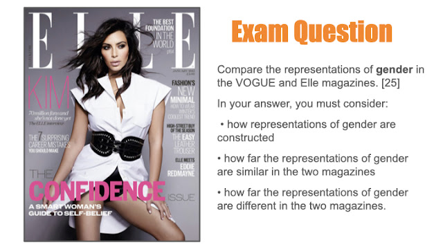
Similarities:
- Women are being represented as powerful and confident on both
- They both talk about fashion and beauty
- They both use a serif font which makes them seem trustworthy
- The cover lines on both use a sans serif font showing that they
Differences:
- They focus on different things: Vogue ---> Serious topics and Malala's story
Elle ---> Body image and beauty
The two magazine covers are both similar in some ways but overall they are both different in the way women are being represented.
One way in which women are being represented as confident is by using imagery. On the Malala cover, the way her hand is positioned draws attention to her face and she is using direct address with a slight smile on her face, showing self confidence. Vogue have used a medium close up to show that their cover star isn't there to model fashion but instead to challenge the stereotypes of it being a fashion magazine and instead focus on a much more serious topic. In contrast, the Elle cover uses a long shot in order to show off the cover stars body and the outfit she is wearing. Their cover star is being shown as the 'stereotypical woman' by making her seem attractive and confident. Their cover star is subjected to the male gaze theory. Even though women are being portrayed in a different way on each cover, they are both being represented as confident.
Another way women are being represented in a positive way is by the anchorage included on the magazine cover. On the Vogue cover, the cover star's name is the largest piece of text, not including the masthead. This emphasises her importance and the reasons why Vogue have chosen her as their cover star. The colour of her name is white which clearly contrasts with the red background, making it stand out even more. Her name has been written in a serif font which makes the magazine seem trustworthy. However, despite her name also being one of the largest pieces of text, Kim's name has been written in a sans serif font which can represent Elle as being up to date and modern. Her name is pink which is considered to be a stereotypically feminine colour.
Both covers have very similar cover lines about fashion and beauty. The Vogue cover speaks about their 'guide to summer beauty' just like the Elle cover talks about 'the best foundation in the world'. Both of these cover lines link to Vogue and Elle being womens lifestyle magazines. However, on the Malala cover they represent women in a very positive way by describing Malala as a survivor, activist, legend. The Elle cover represents women as being beauty oriented as most of the cover lines focus on fashion. Despite both covers having similar cover lines they represent women in a different way. On the Elle cover, women are being represented as only ever focusing on fashion and beauty. On the contrary, the Vogue cover represents women as being brave.
The colour palettes used on both covers are very different. The Malala cover uses colours such as red and white which can connote passion. This could be to show Malala's passion and determination towards the topic she supports.
(not completed)
17/25
Excellent work!
WWW: detailed and appropriate analysis of both products with accurate terminology
EBI: It's a shame you didn't finish as you have done so well. Try linking the elements you discuss to the overall representation as you tend to focus on individual elements.


MAG REPRESENTATION EXAM Q:
ReplyDeleteWWW: you've compared both covers well and included gender stereotypes and accurate terminology
EBI: include more specific examples in your answer
HOMEWORK - GQ COVER
ReplyDeleteGreat - some brilliant points.
Why do you think she has been made to look sweaty?!
GQ/VOGUE RESEARCH:
Great!
REP HWK:
ReplyDeleteA great comparison - detailed and accurate with a clear comparison. Well done!
VOQUE COVER NOTES:
Excellent
VOGUE COVER MEDIA LANGUAGE:
Strong analysis
VOQUE ML HWK:
WWW: Good ideas with specific details to support
EBI: Don't forget you can bring in the other cover lines too - you don't have to just focus on the cover star.
VOGUE REP NOTES:
Good
VOGUE EXAM COMPARISON Q
17/25
Excellent work!
WWW: detailed and appropriate analysis of both products with accurate terminology
EBI: It's a shame you didn't finish as you have done so well. Try linking the elements you discuss to the overall representation as you tend to focus on individual elements.